005
The first discussion with the client was about how they want a minimal, airy, bright, full of natural light home and not just a decorated apartment. The clients (were very clear about the home they wanted : whites, earthy materials, simple palettes and warmth.
We knew that tearing down some of the walls and opening out the spaces would help get in abundant natural light, which in turn would uplift the quality of the spaces. The wall separating the kitchen and living was hence removed. The main aim was to create a comfortable, calm and thoughtful space keeping in mind the needs and lifestyle of the people living in it.
The apartment is a 1200sqft. 3 bedroom apartment in a plush neighborhood of Nagpur; overlooking lush green spreads around. The clients brief was very short and clear : both of them being minimal personalities, there had to be simple utility spaces , character to host game nights or movie nights, should have a comfortable cozy sofa with the television set being visible from the entire living room. The kitchen opened up to make it an open plan.
The palette for the living and dining room was based on their simple and warm choices with some elements from their childhood that made this apartment into a home.
The entrance lobby has a shoe rack cum bench on a stucco textured wall. A hint of green has been added every here and there in the house. Once you enter the living room, the Window with a coffee spot outside welcomes you with the green view outside, making it a perfect spot for a book lover to read and sip a coffee. It's been designed to look very neat and sleek. The rounded corners add to the cozy feel.
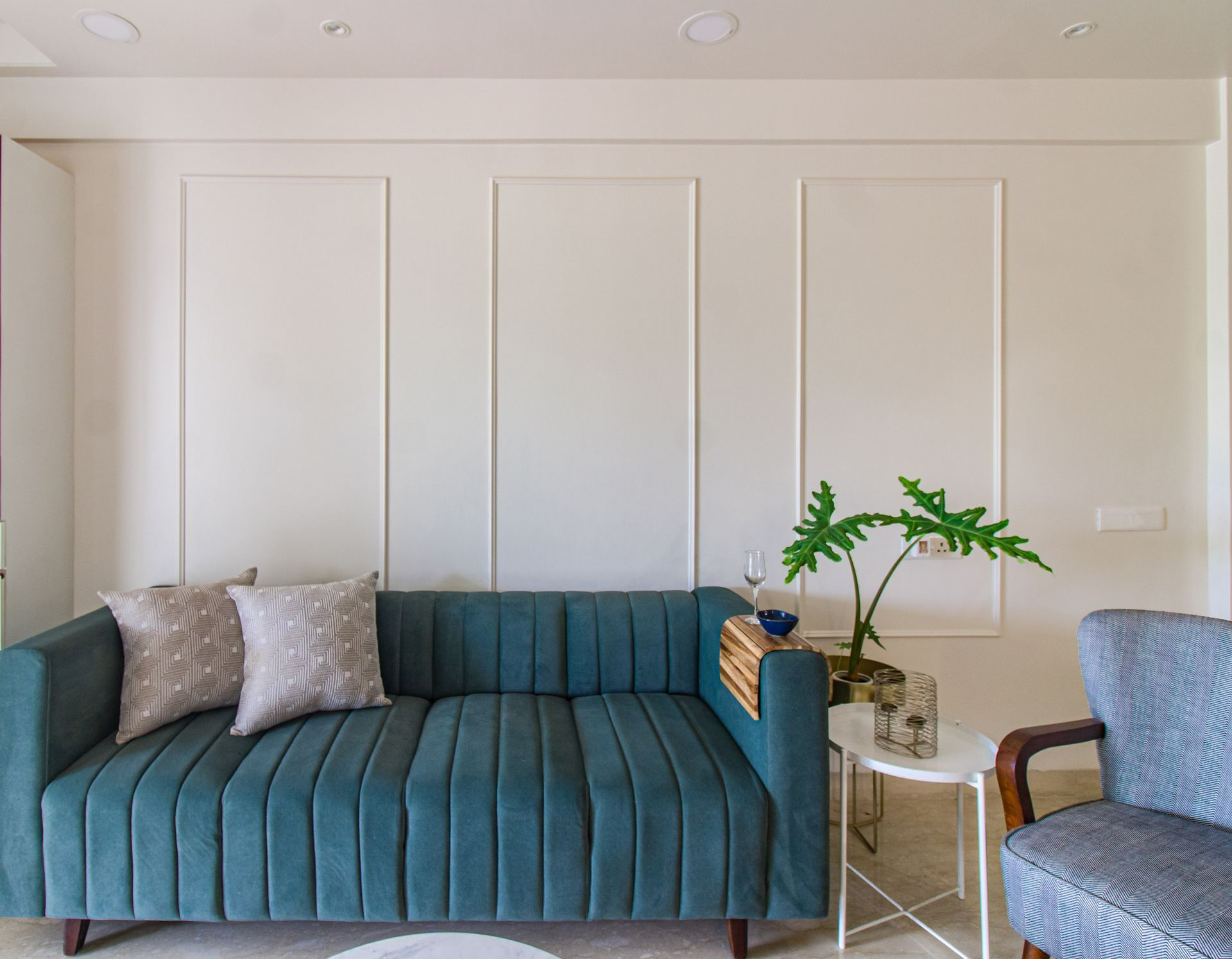
To your left is the coziest sofa for all your naps and movie nights. The wooden palette helped with the warmth of the space and the mirrors and fabric textures added to the simple earthy tone. The black and white accent chairs was a special choice by the client to give a traditional touch.
The Kitchen adds a pop to the entire space with its green color and white quartz countertops.
All the other colors, patterns & textures come in the form of upholstery, soft furnishings, fabrics, artifacts, artwork.
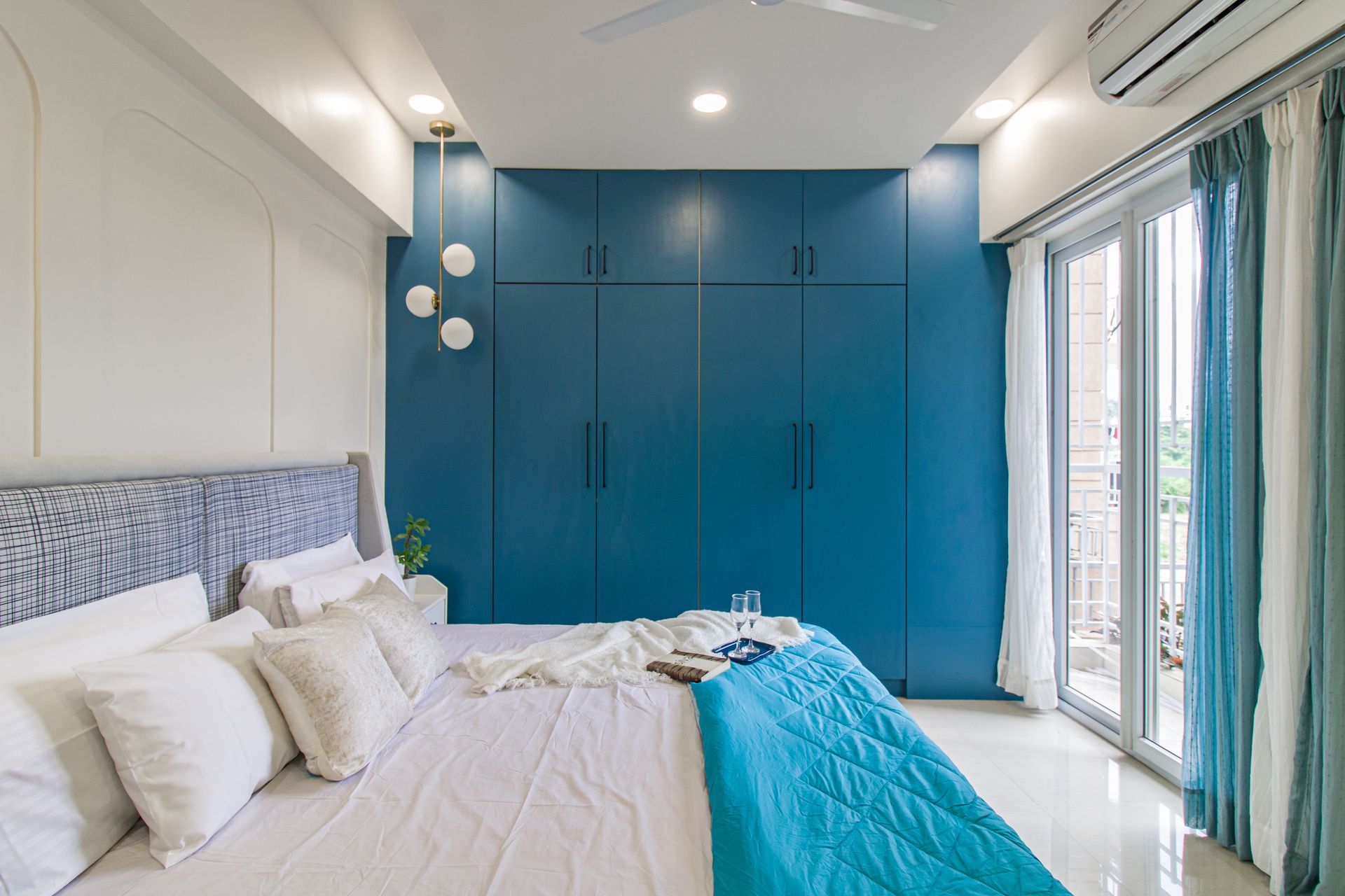
The Master Bedroom opens up to a terrace adding up ample amounts of light to the bedroom.
From the Living room, you overlook the Dining and the Kitchen. The dining is complete teak .
The overall feel of the living room is very bright due to the whites, wooden browns and soft stucco textures with bold green hints.The curtains allow natural light throughout the day, never giving them a dull moment. The space is a minimal abode with abundant warmth.
The Monochrome Blog


Email us at:
inbox@themonochromestudio.com
All Rights Reserved | The Monochrome Studio


